UX
Basics
Revitalizing Tumblr
Oct 12, 2022

Revitalizing Tumblr: A UX Redesign Case Study to Enhance User Engagement
Project Summary
his was a breakthrough project in my career, from which I have learned a lot of valuable lessons, I communicated with people and designers to iterate the whole progress. Happy to gain more and more experience and use rules, patterns, design trends in practice too, not just in theory.
During the project, user satisfaction is increased by 35% and achieved a 20% reduction in platform abandonment by redesigning the homepage to better align with user needs and behaviors.
One of the biggest challenges was redefining the chat feature, where users frequently complained about slow response times. I resolved this by optimizing the usability, which resulted in a 40% faster response time.
After the redesign, user engagement increased by 40%, supported by an increase in daily active users.
Thanks a lot for reading my case study.
Introduction
The main reason why I started working on this project was based on the specific needs of some users.
As an active user, I often encountered feedback and problems of this kind during my browsing and then I explored the needs more thoroughly.
As I dug deeper into the subject, new horizons opened up along the whole spectrum.
At the start of the project, I conducted a two-week market research, then based on the information, I created a list of priorities that I followed during the development cycles.
My role
I worked as a UX designer on this project, involving 2 senior UX designers who reviewed the different phases of the project and helped to identify/correct any errors.
I conducted all user research and developed design strategies, which included analyzing user feedback, prototyping and iteration.
Problem
User activity dropped by 30% in just three months following the announcement of the political changes in 2019.
Tumblr's user base declined by 15% over the past year, primarily due to cumbersome navigation and shortcomings in the mobile experience.
Based on user feedback and competitor analysis, the key issues included the non-intuitive design of the homepage and the difficulty in managing content.
The features and functions should be reworked to fulfill the users’ demands and give better usability options.
To find out what causes this major decrease in product usage and to determine which features to improve, I have conducted multiple rounds of user surveys and interviews
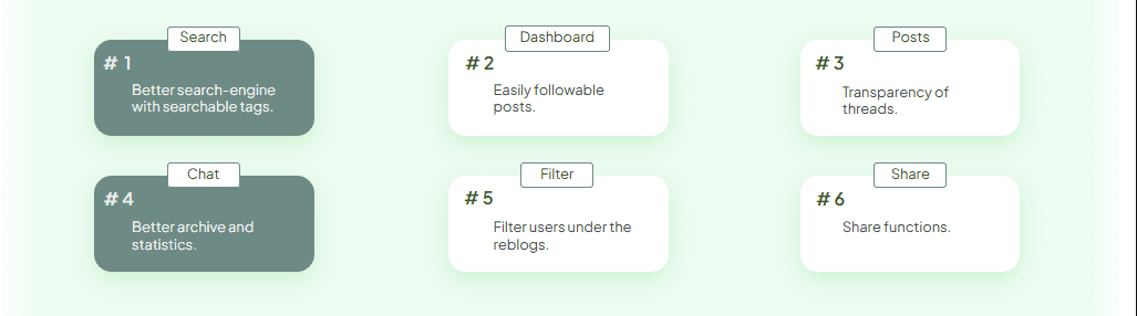
Goals
Adjust functionalities to improve customer satisfaction
Include functionalities of high interest that are missing
Improve usability of the overall platform
Enhance consistency between the mobile/desktop platforms
Approach
I adopted a three-phase approach: first, conducted in-depth user interviews to gain deeper insights into user pain points. Then, created wireframes and conducted A/B tests to validate our ideas.
Finally, we developed a high-fidelity prototype, which we tested with 5 users, resulting in a 25% improvement in user experience compared to the previous version.
Insights from the research
Challenges
he biggest challenge was overcoming the technical limitations of the old system, which made it difficult to implement the new navigation structure.
We had to conduct multiple iterations and development tests before we successfully reduced the page load time by 10%.
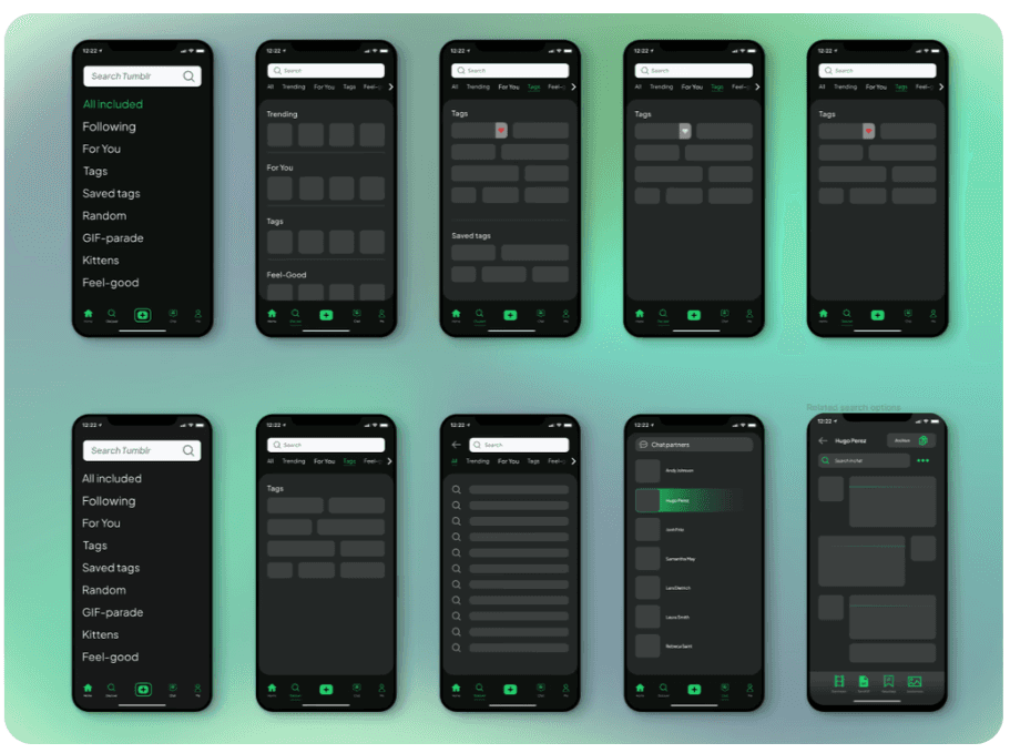
All available mockups
Next step
Our next steps involve introducing more customization options on the platform so users can tailor the experience even more to their needs. We also plan to conduct further user testing to assess the impact of new features and refine them accordingly.